
Verifone Pin Pad
Industrial Designer
Design team
Native Design SF
Key role
Brainstorm, Design research, CMF development, 3D model, Render, Rapid Prototypes
Our objective with this Verifone Pin Pad project is to advance VeriFone’s catalog of electronic payment system products. So we are seeking to holistically improve the payment experience by evolving the existing design language strategy (DLS) to focus on the needs of the user.
Advancing the Design Language of VeriFone
This project redefines VeriFone’s Design Language Strategy (DLS) to deliver a more seamless, intuitive payment experience. By building on the existing system, we created a cohesive, user-centered design that enhances usability and reinforces the brand in a competitive market.
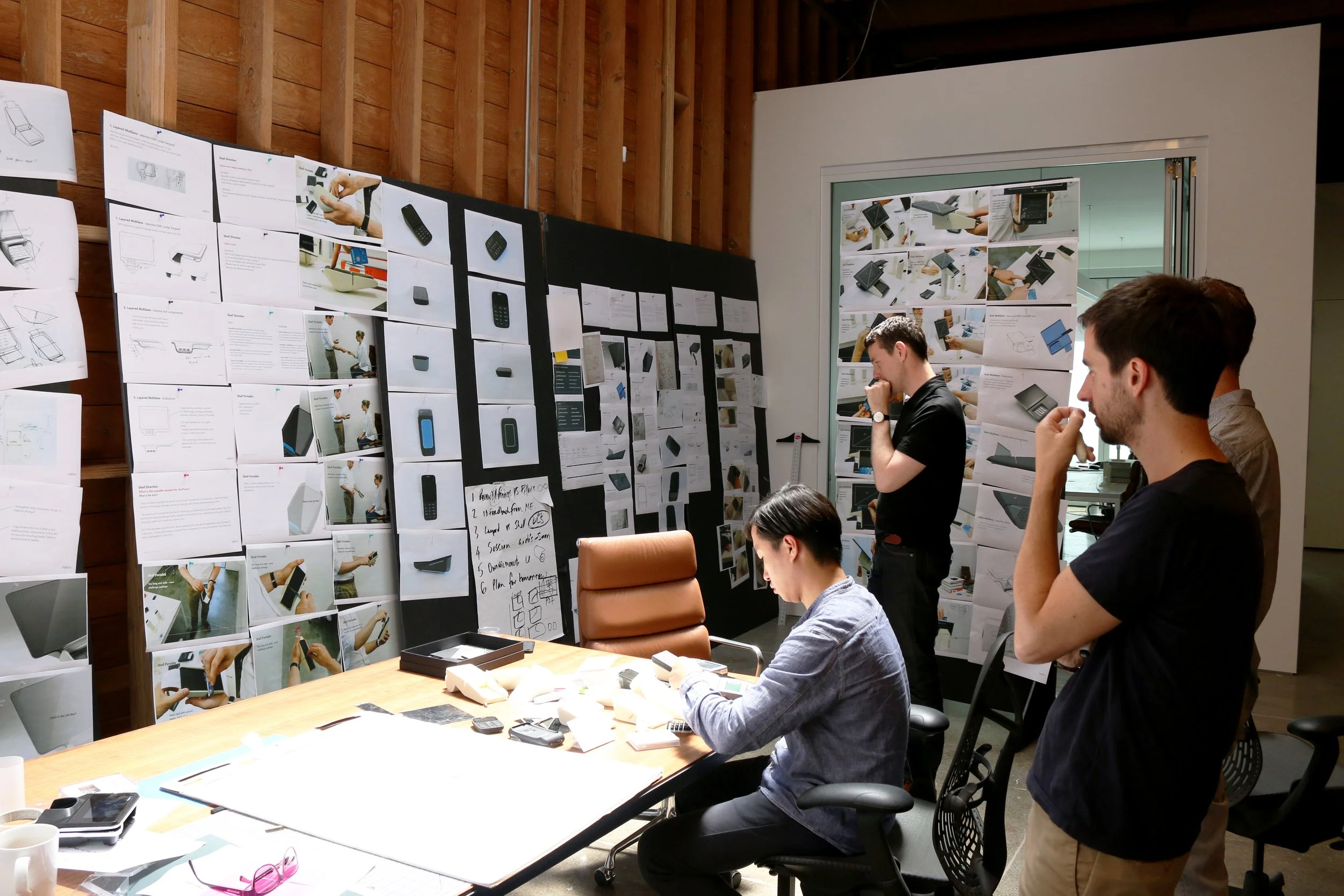
User & Market Insights
We analyzed VeriFone’s ecosystem through the perspectives of resellers, merchants, and end-users. Through interviews, workshops, field visits, and research, we identified key pain points and uncovered user expectations for next-generation payment systems.
Designing the Future of Payment Devices
Redefining payment device form challenged us to overcome technical constraints and ingrained habits. Through user testing, rapid prototyping, and iteration, we arrived at a solution that feels intuitive yet refreshingly new—setting a bold new standard for modern payment experiences.
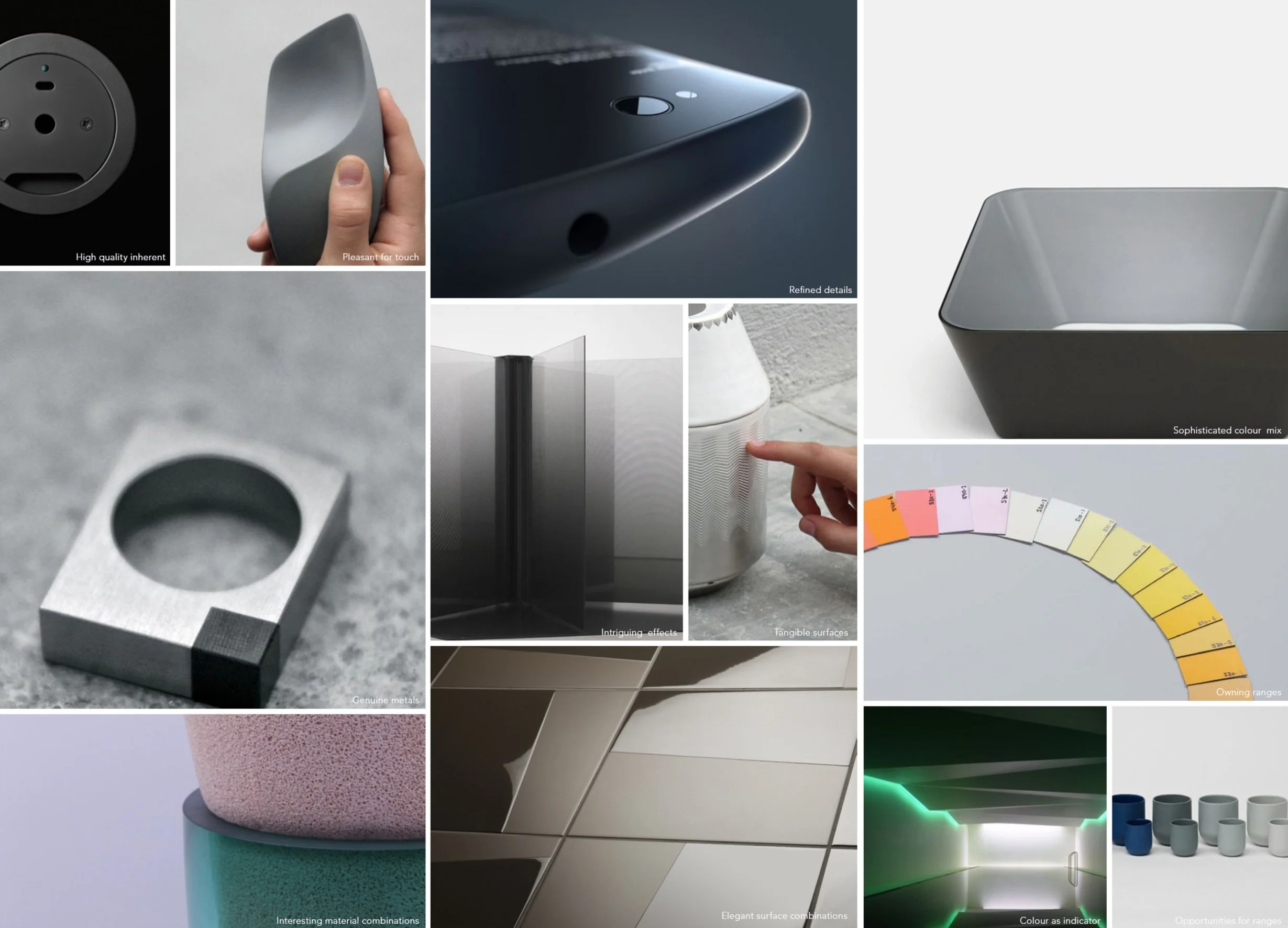
Materials perception, Glorious subtleness, and Color palette
We design innovative solutions that not only solve problems but also create memorable experiences. Color and material choices are carefully considered to enhance visual appeal and maintain a cohesive product portfolio. More than just aesthetics, CMF (Color, Material, Finish) becomes a strategic tool — a foundation for brand recognition and a key market differentiator. By establishing strong visual links across products, we express the brand’s purpose and values consistently and meaningfully.

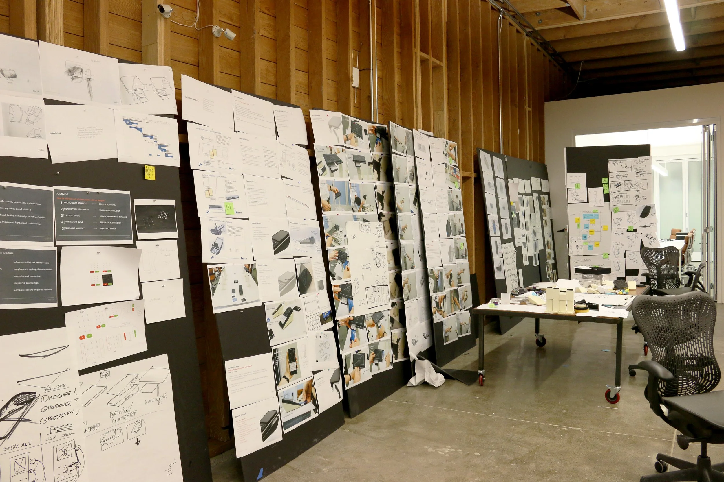
Design Concept Development
Every concept was grounded in research, observation, and user testing—never just designed to “look good.” These visuals helped earn client trust and win over skeptical engineers, proving that thoughtful, story-driven design can be a powerful force for alignment and progress.
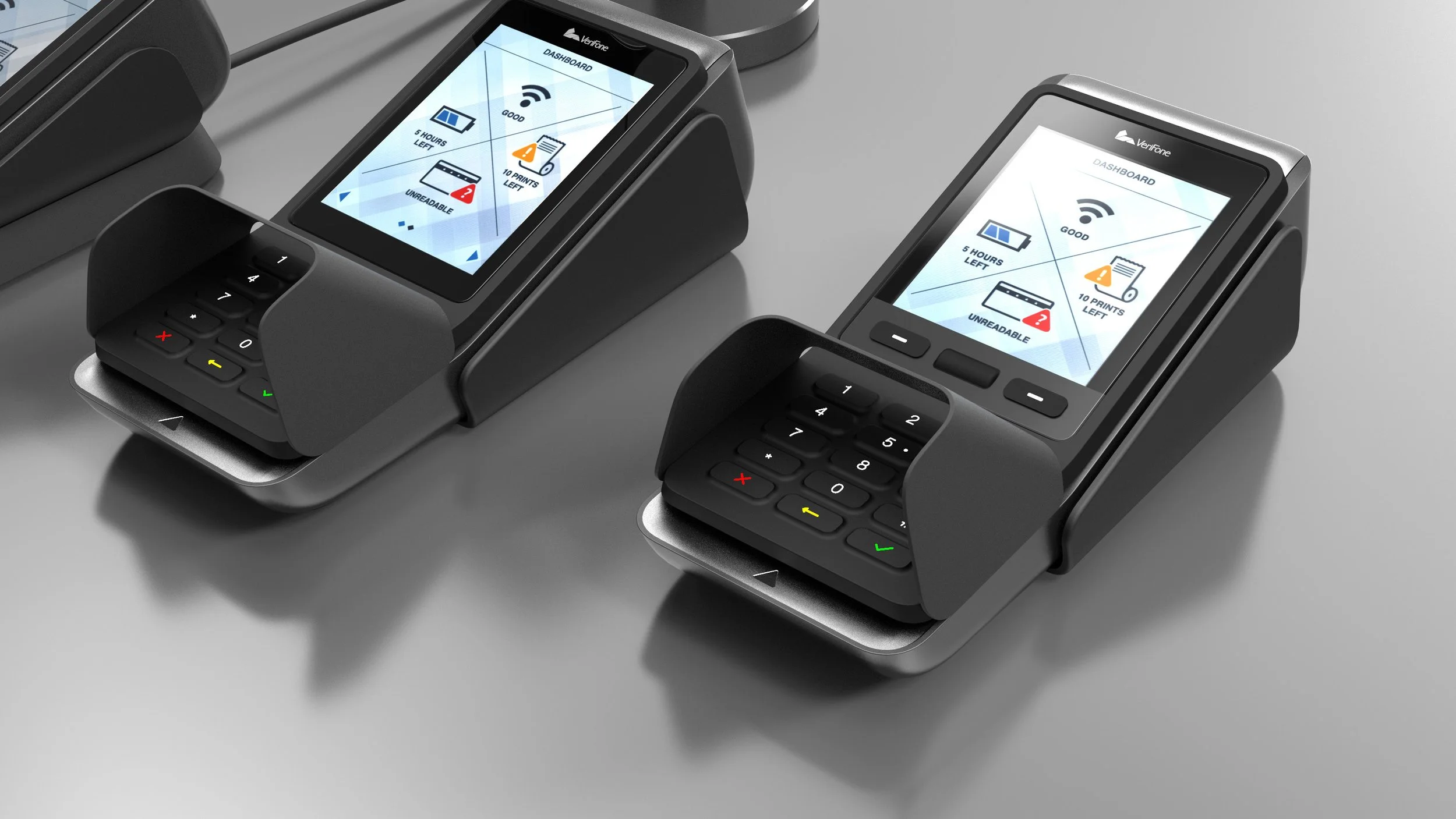
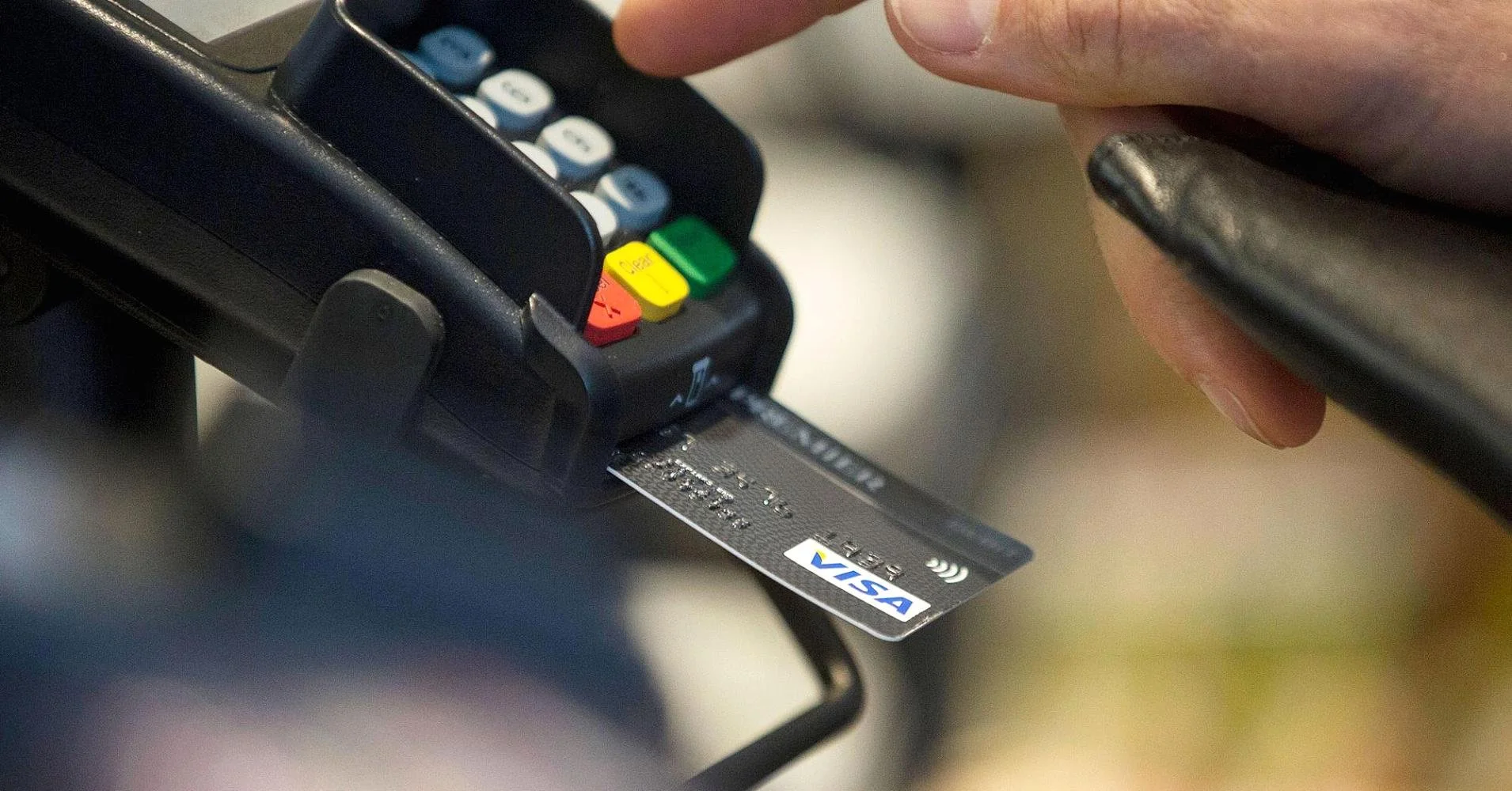
Designing for Security & Usability
Security should feel intentional yet invisible. Our ergonomic shield enhances protection while naturally guiding the user’s finger—creating a frictionless, intuitive experience that balances safety with seamless interaction.
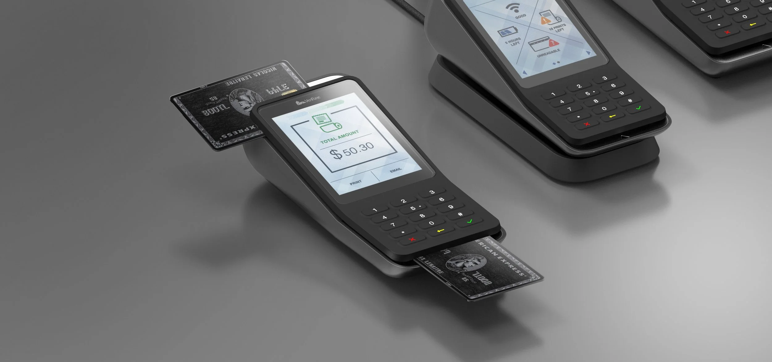
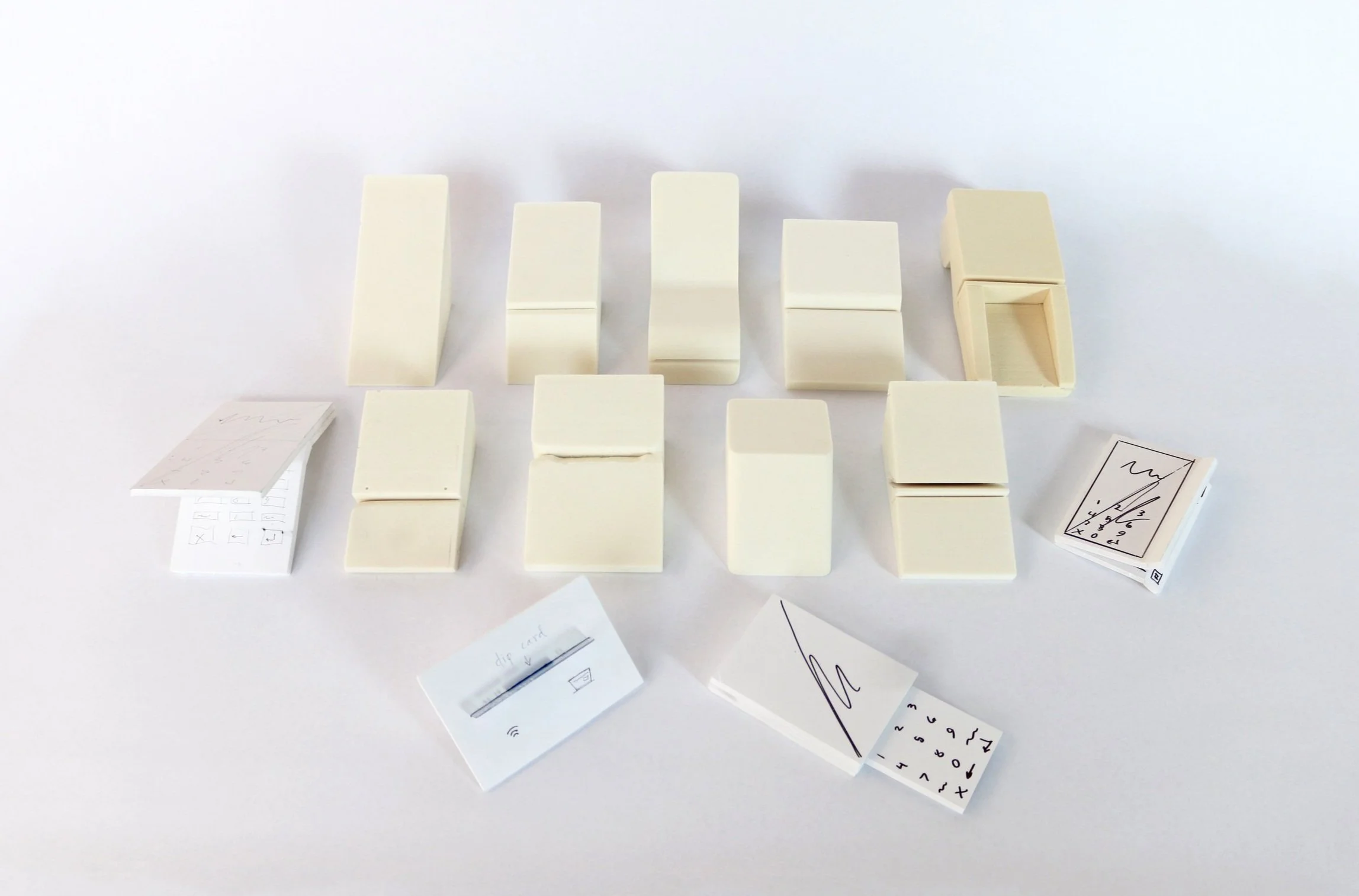
Form Exploration & Interaction Design
Through extensive sketching and physical model-making, we optimized the swipe and card insertion angles for both comfort and efficiency. Visual and tactile hierarchies were carefully crafted to guide user interactions naturally. As a result, the new pinpad delivers one of the most ergonomic and intuitive experiences users have ever encountered.

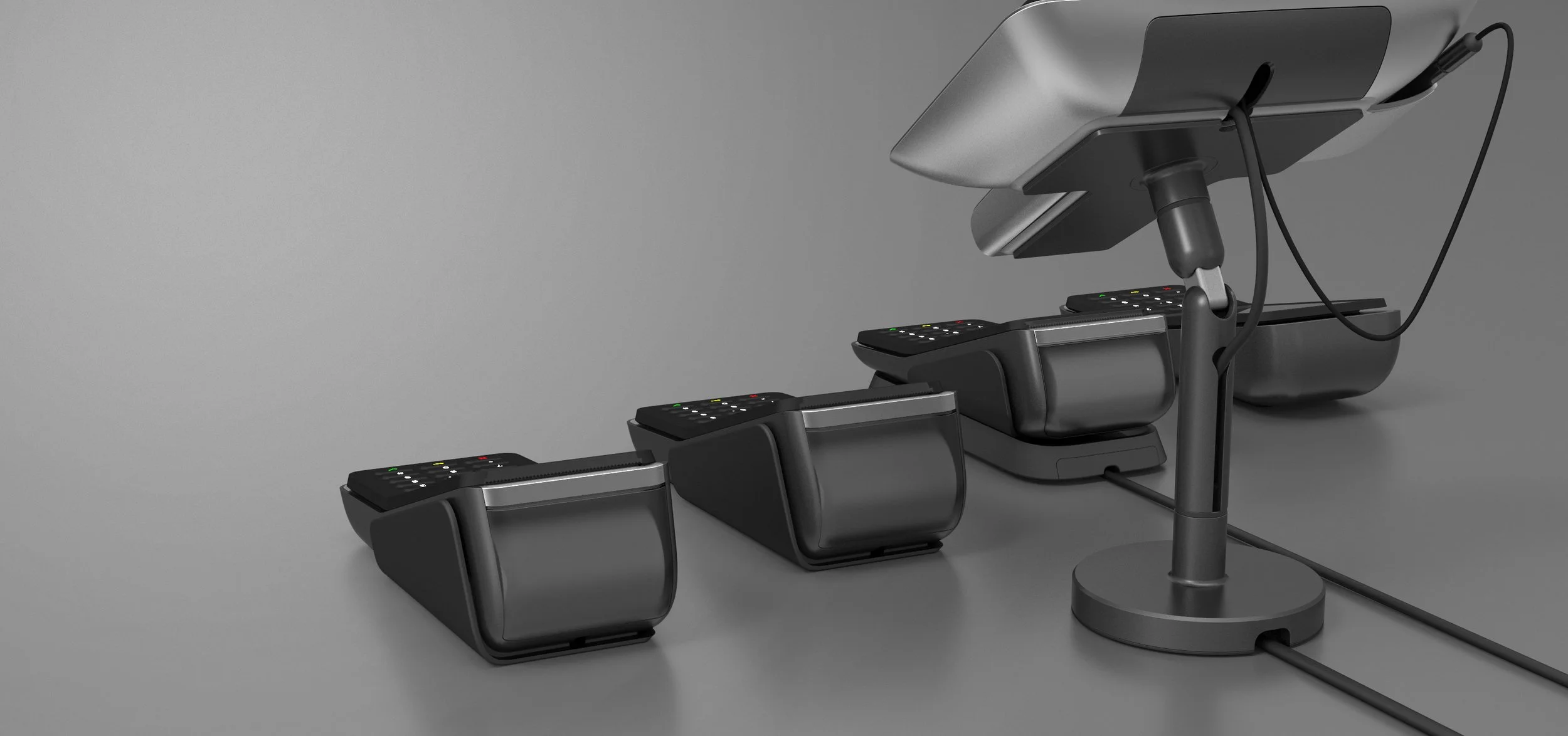
Material & Form Refinement
The new multilane design features a seamlessly curved metal base and a flexible leg structure, offering a refined silhouette that elevates the overall user experience. Carefully selected materials differentiate zones of interaction—communicating functionality through touch and texture while enhancing both aesthetics and usability.
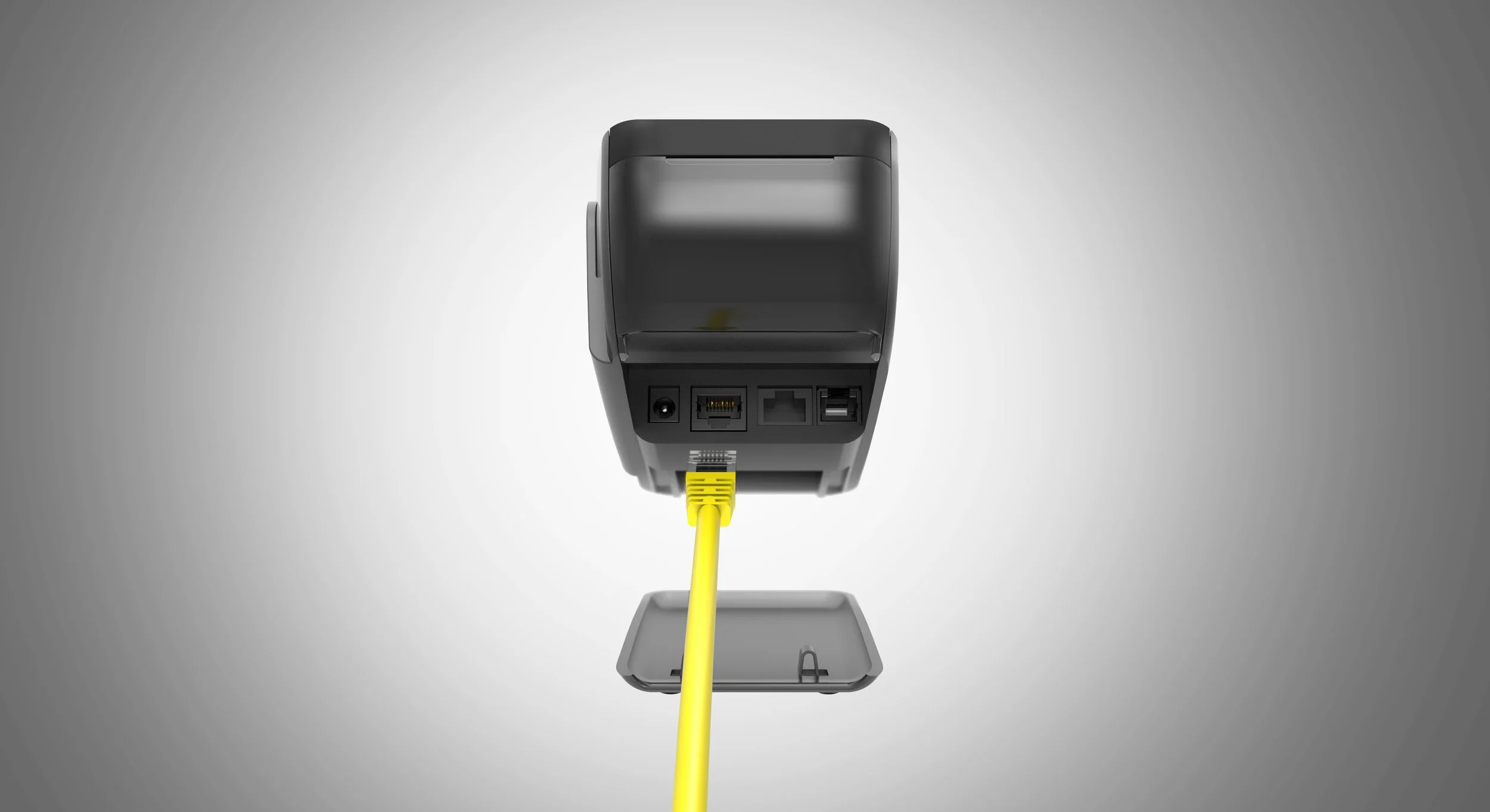
Protected Component Integration
Input components are uniformly positioned within a concealed area to maintain a clean and cohesive design. Even during cable connections or maintenance, the protective cover remains in place—safeguarding internal components while preserving the device’s streamlined appearance.
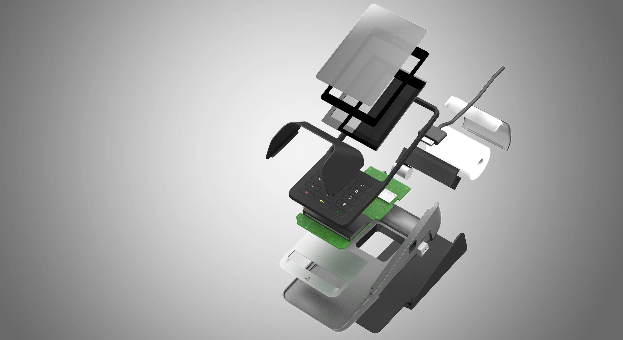
Modular Design & Structural Integrity
Minimizing part separation was a key focus to enhance both durability and visual cohesion. The design also aims to unify core and interchangeable components, allowing flexibility to meet diverse regional requirements while maintaining a consistent global identity.
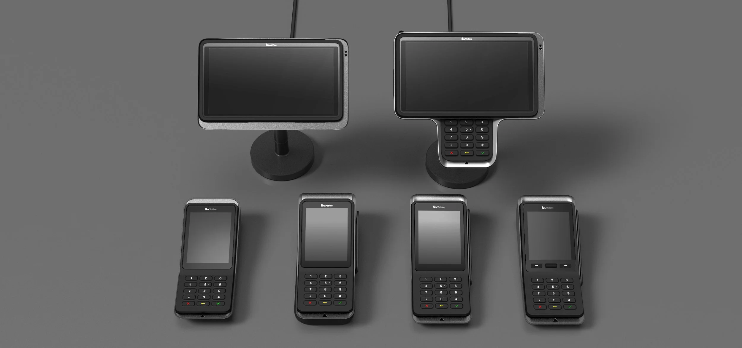
Design Consistency Across Product Lines
Although each product line varies in form and function, the use of consistent CMF (Color, Material, Finish) and refined detailing ensures a cohesive and harmonious design language across the entire system.
Brand Identity Through Material Honesty
The new design language reflects a sense of honesty by showcasing authentic quality through carefully chosen materials and finishes. It strengthens the brand by adding value through distinct characteristics and recognizable visual and tactile interactions—creating a more memorable and trustworthy user experience.

Final Implementation & Impact
The final product was successfully launched, incorporating key insights from our studies on card insertion and swipe angles, button ergonomics, receipt paper handling, and UI screen flows. I'm proud that our design recommendations were adopted across the new product lines. Additionally, the CMF strategy and detailed design elements we proposed were largely maintained—ensuring consistency and elevating the overall user experience.
